Design Objective: Choose an already existing North Carolina festival and create new branding and a style guide. Also, create a microsite and make an itinerary for the festival.
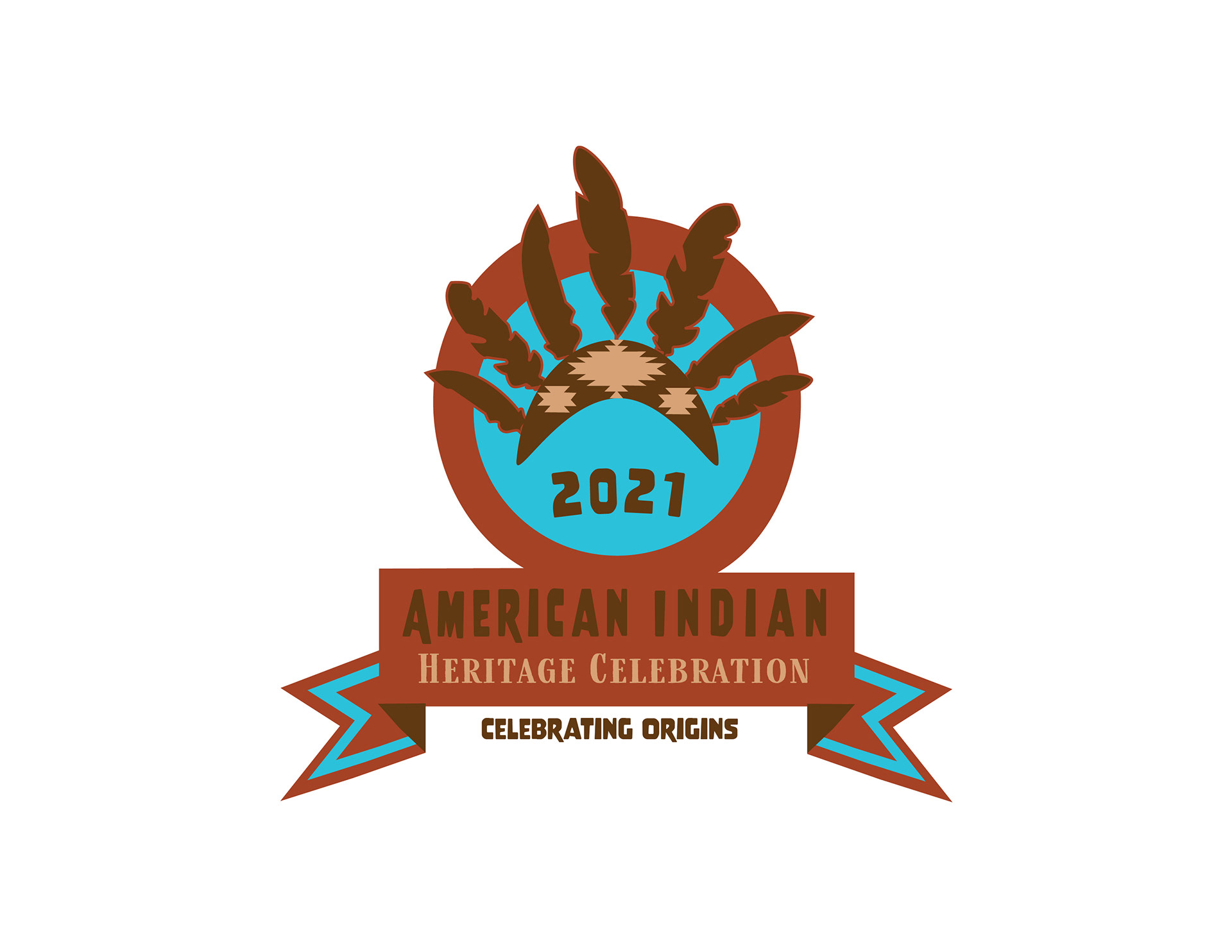
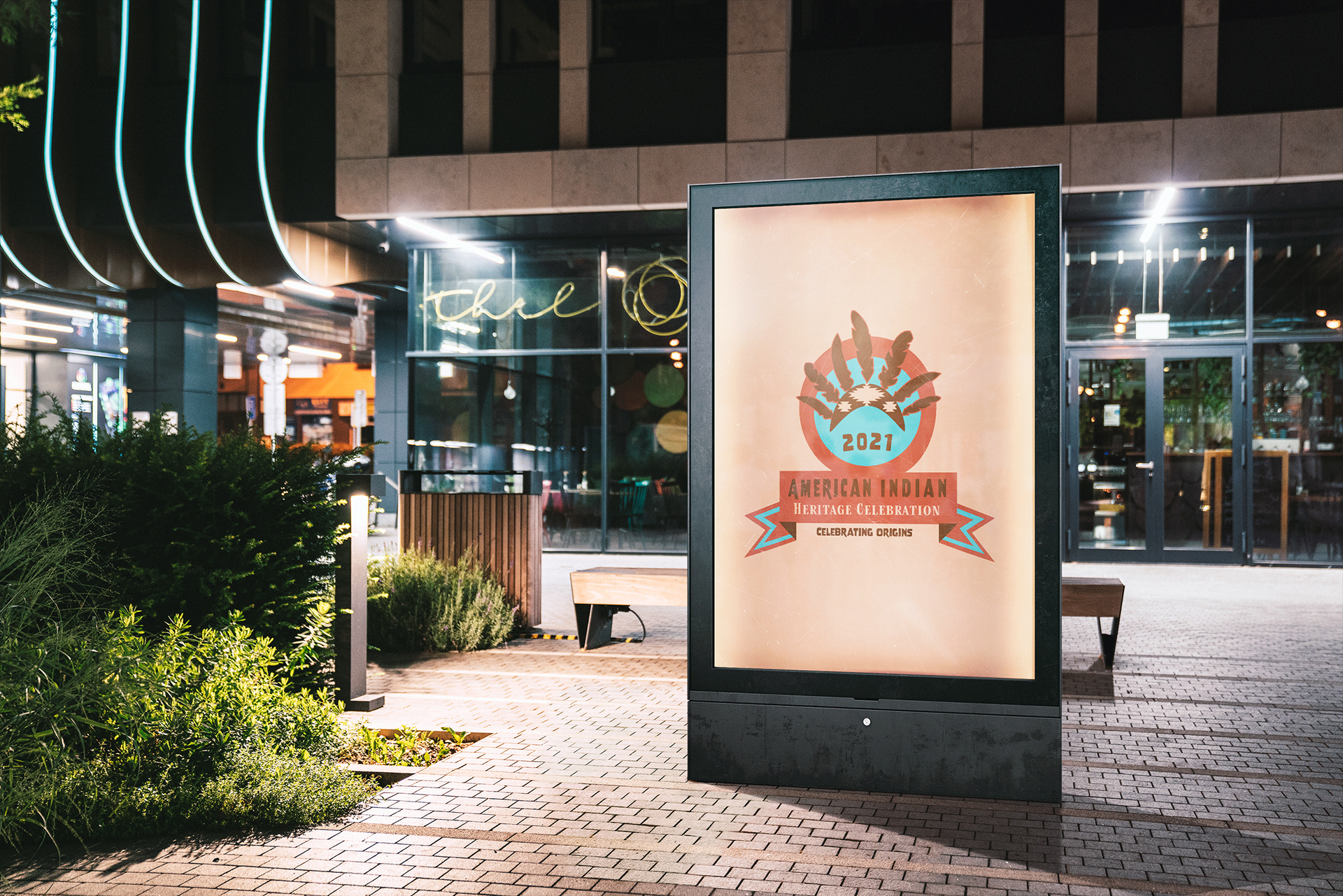
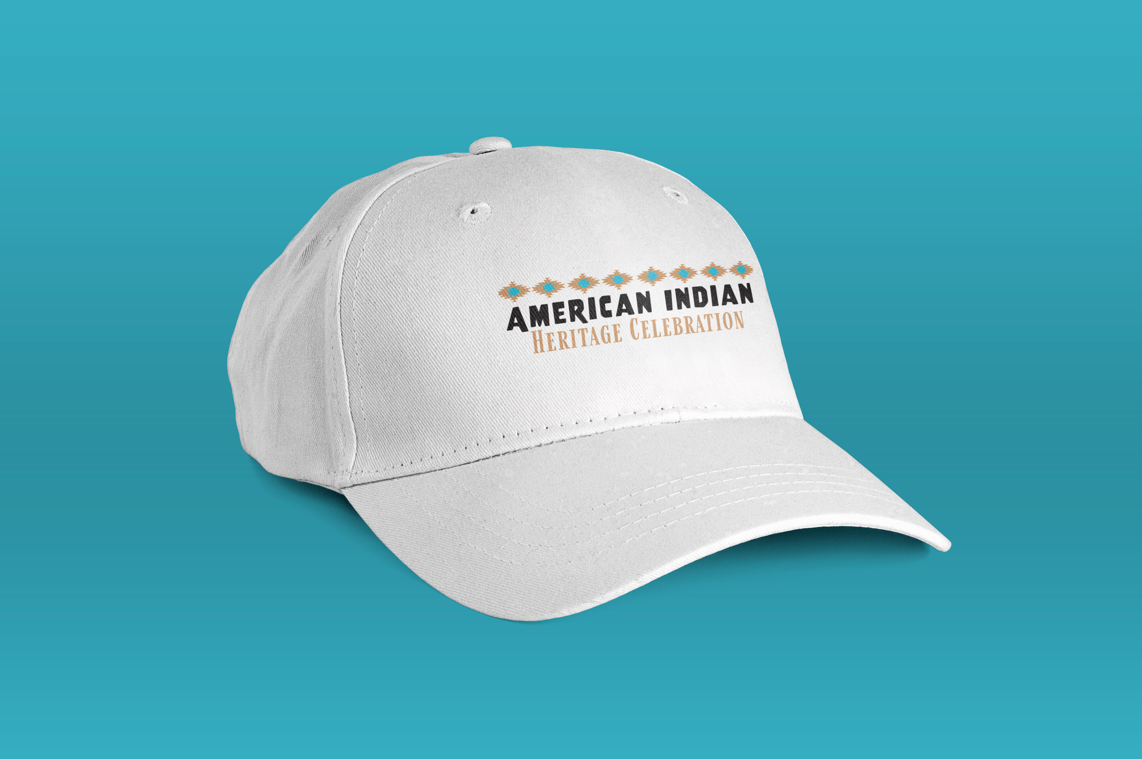
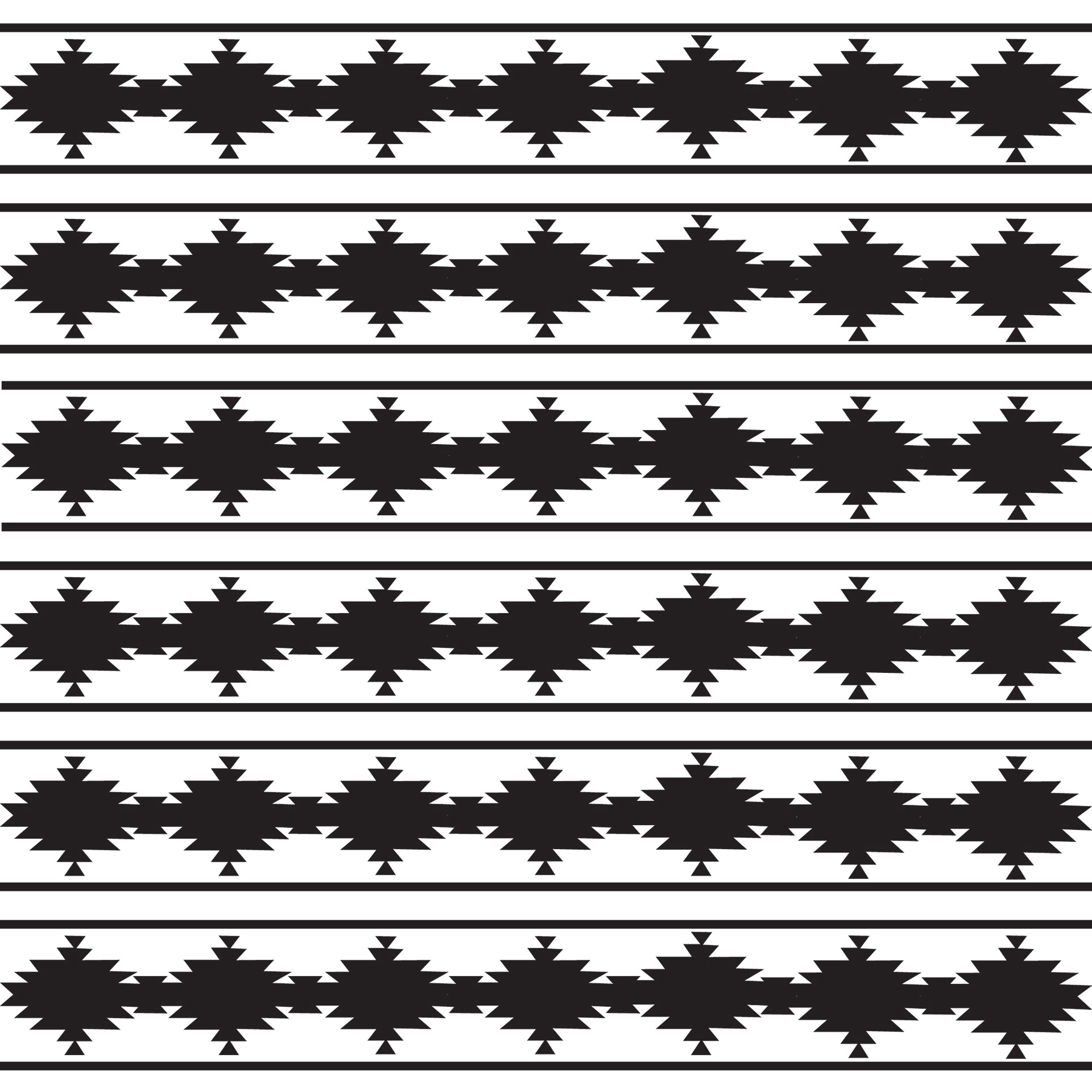
When researching NC Festivals the American Indian Heritage Celebration caught my eye because there were many different avenues that could be taken when creating a new logo. Creating a mood board with imagery helps to best describe what the festival offers and serves as visual inspiration. One of the images from the mood board inspired the whole color palette used in the rebranding of the festival. The overall theme of this festival is very rustic and natural, so to honor this a badge-style logo was introduced. The typographical elements play into the rustic and natural feel by having rounded edges that almost appear aged, and the staggering baseline makes the type feel as if it’s dancing. This sans serif primary typeface has been paired with a serifed, rustic typeface to complement each other. The feathers included in the badge draw the eye inward to the logo itself, also by doing this creates continuation and contrast. The tagline represents what the festival is as a whole: celebrating where you came from. So this solidifies what the festival is as a whole.