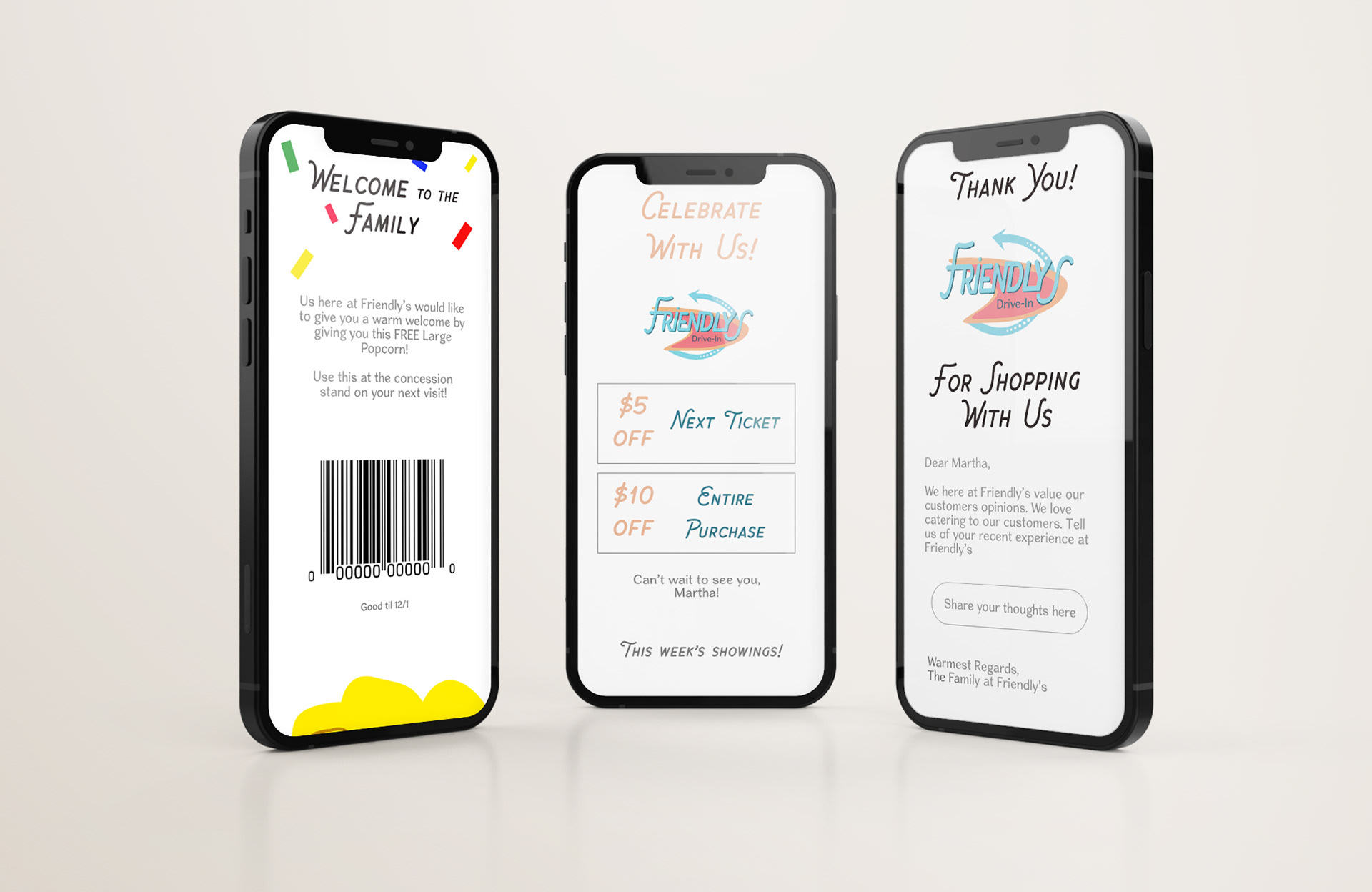
Design Objective:
Create a typographic logo for a Drive-In Movie Theater and include a digital marketing case study, animated logo, and marketing campaign.
Design Overview:
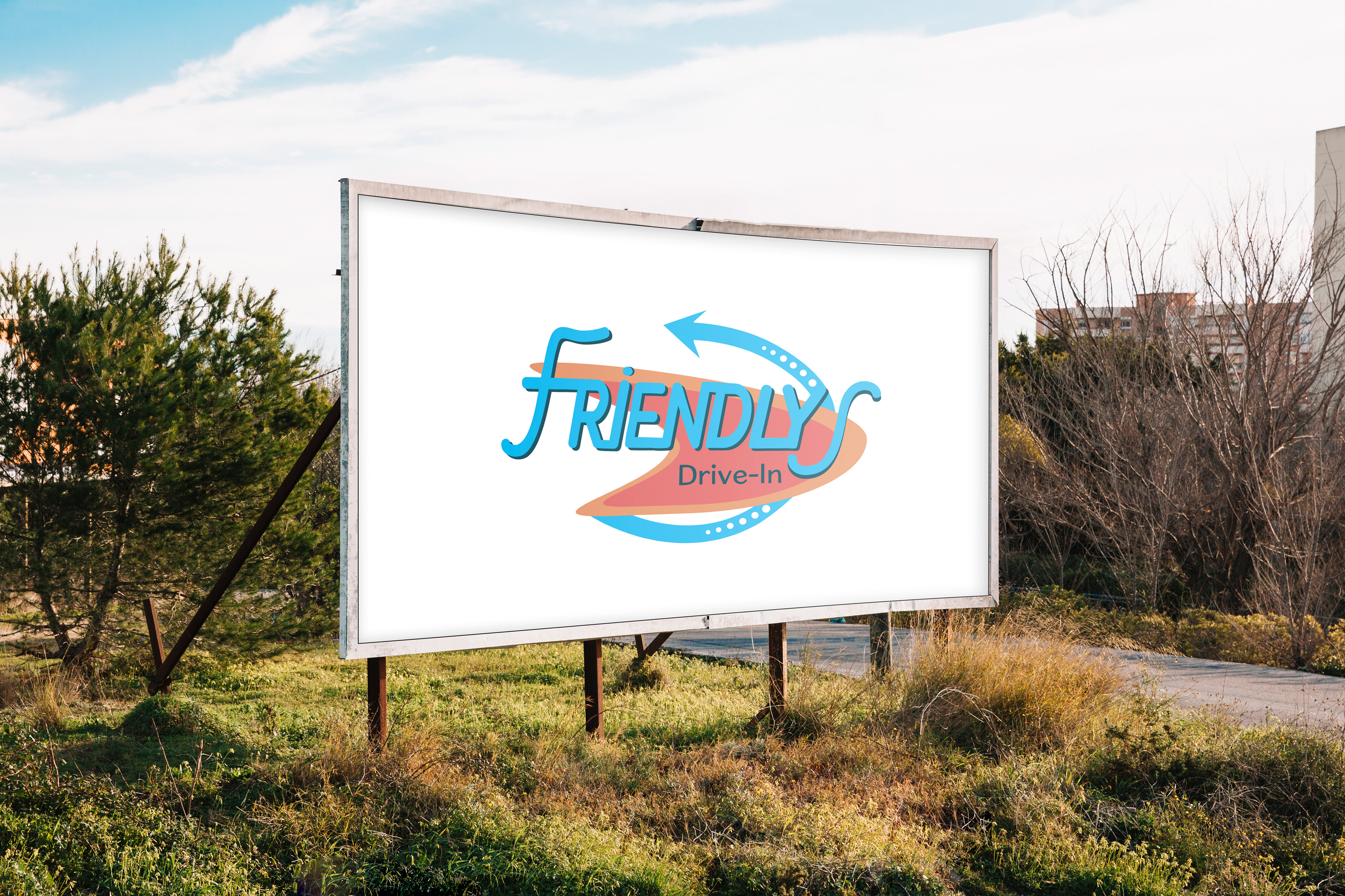
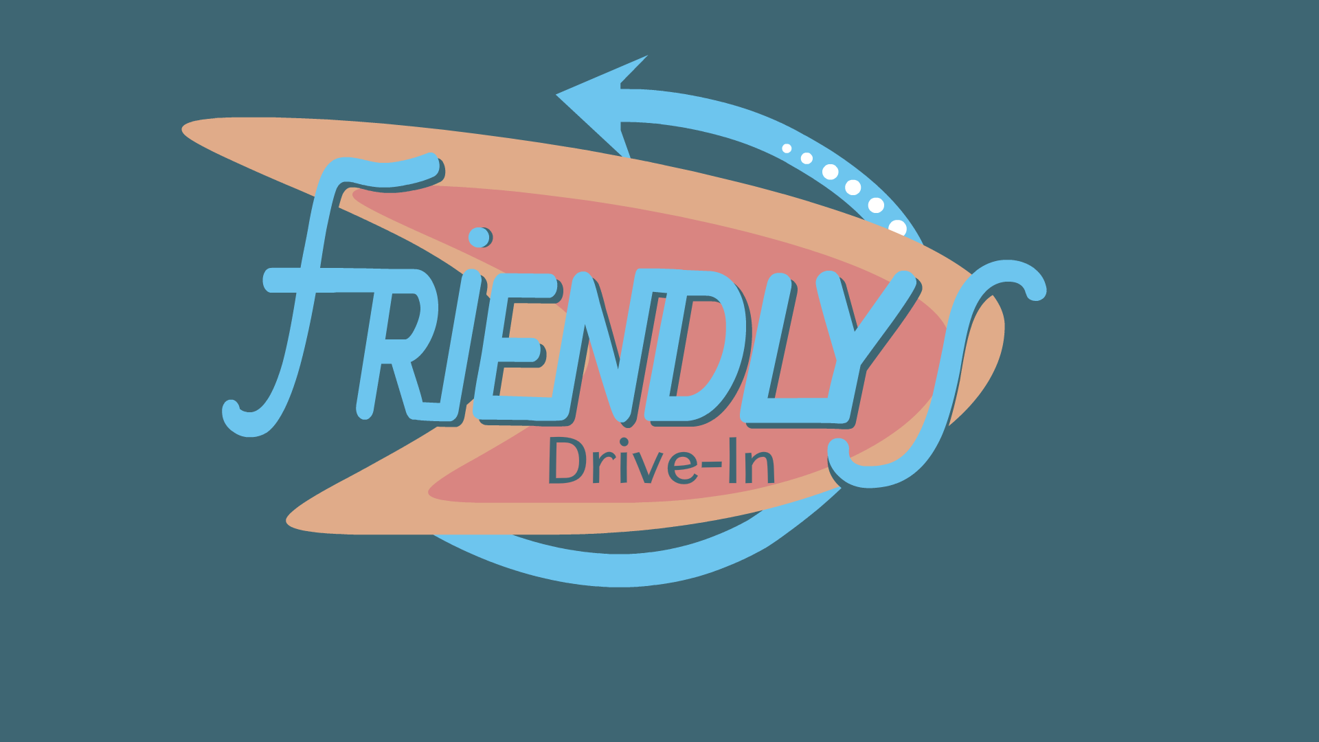
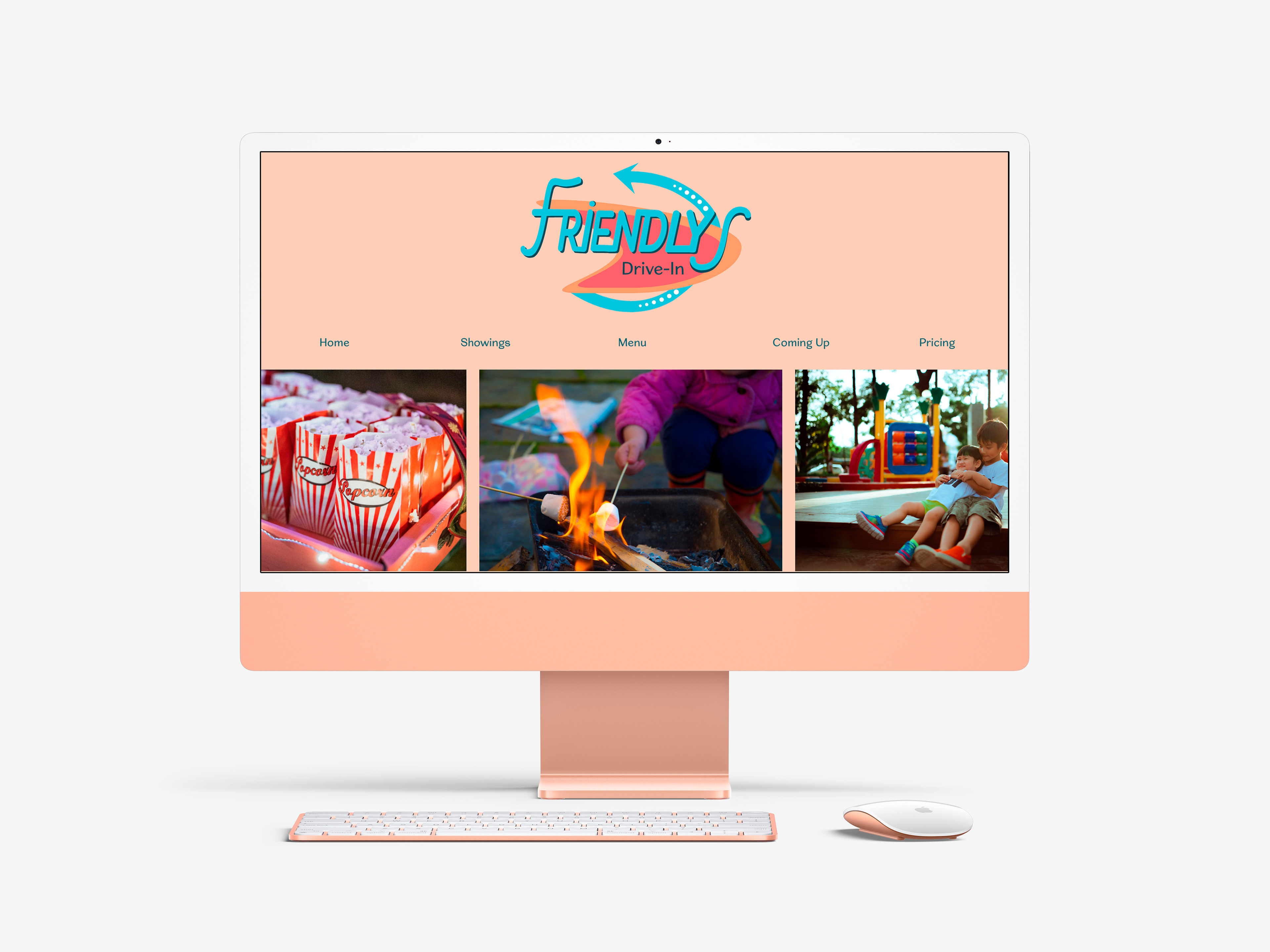
Typography, color, and movement make this a successful manipulated typographic logo. The typeface choice was used because this is a family-friendly drive-in. So, the round edges of the letterforms and script-like font, make the logo appear welcoming and warm. Also, by connecting the letters it creates a sense of connectedness, which is fitting for the family-friendly aspect of the theme. This typeface is sans-serif with the little tail on the beginning “F”, but it still has a vintage look about it, due to the double layering. For the secondary type below the logo, there is balance by using a simple font that also has personality due to the uneven width of the lines. As for the surrounding shapes within the logo, like the odd-shaped circle and arrow going around. These items help to add the vintage aesthetic that was achieved. The inspiration came from vintage road signs and logos. The arrow adds movement and engages the viewers in looking at the whole logo and the different dot sizes included add variety to the band of the arrow. The color was another important decision because there were many different routes this logo could’ve gone. Considerations such as pink, green, and yellow came about, however, the chosen color palette was a warm orange, a peach, and a dark navy with a light turquoise. These colors are vintage in nature, but when applied create a warm, inviting feeling. They can also appear bright and playful, appealing to the theme.